


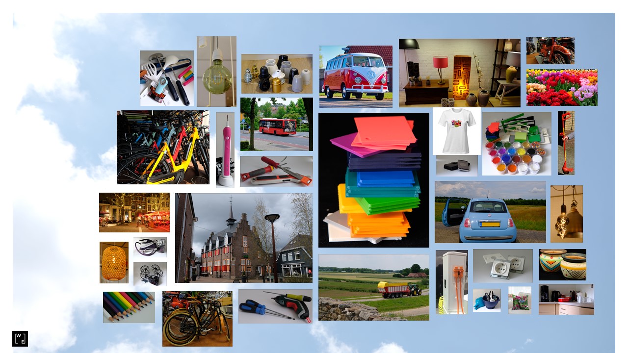
Engineering Plastics and Brand Identity.
Humans are visual creatures, in which Colour plays a determining role for most of us. Prehistoric man already viewed green as safe, a sign of new life, and red as danger, the Colour of our blood. With civilisation increasing (and decreasing bond with nature) and acquiring all kinds of cultures, including religious ones, symbolism was increasingly assigned to less functionally important colours. Think of purple for royal and spiritual, think of white for pure and beautiful, think of black for death, sadness and evil. And contrary to popular belief, symbolism can also be sensitive to trends: think of pink for girls and blue for boys, which has only been in use since 1940 and may decrease again in the coming years.
But because we assign symbolism to colour (or vice versa) and have a variety of associations with it, it is used in all kinds of activities, such as marketing.
Because Colour Sells!
Trendsetters and designers know better than anyone what the importance of colour is, in cohesion with societal developments, to permanently seduce consumers to buy new items. At least twice a year (and now apparently continuously) the new colours are set, for clothing, cosmetics and furniture, among other things.
Its opposite is Brand Identity, where the recognition of a colour in relation to the brand becomes evident and important that it is stable and unchanging; the power of repetition!
For Engineering Plastics, a good example of Brand Identity is that of Power Tools: from drills to lawnmowers, from hand tools to electric chainsaws. Here too, culture and associations through marketing play a determining role in the brand colour… but sometimes colours are also chosen for practical reasons.
Ever wondered why Husqvarna has the orange colour for its chainsaws? The story goes that for the saws to be traceable when working in the green and brown environment, it had to be a contrasting colour. When hiding red, yellow and orange chainsaws, the orange Colour was 100% recovered!
And Stihl was once dark red, but from the 1970s the designers felt it was time for a more dynamic and modern(!) look and the bright orange was chosen.
Ever wondered why Makita chose the green-blue colour for its drills? Probably because, for many centuries in Japan, blue was the most commonly used colour with deep blue and indigo dyes from the Indigofera tinctoria and Ísatis tinctoria plants. And blue is often associated with conservative, traditional, calm and trust; all the more reason to keep this brand colour.
Ever wondered why Stanley and DeWalt have the characteristic yellow colour? Well, that one is a bit more basic: red and orange were already frequently used, so the contrasting yellow was chosen! Although it did change to a warmer (and less cheap looking) yellow in later years.
And maybe Sabo chose the colour red because it has the association with strength and aggression, which might fit well with a good lawnmower.
For Bosch I can only assume that the green was chosen because it is such a natural colour for the consumer with the associations of safety and harmony.
By the way, both Bosch and Sabo have chosen a different colour for the professional user: Bosch has blue - traditional and trusting? - and Sabo has a somewhat brighter green - nature and safety? This may be because professionals choose slightly different from consumers.
But whatever the reason may have originally been for the brand's colour choice, little has changed in decades.
And it works!
When you walk into the average hardware store, your eyes automatically go the shelves of beautifully coloured Power Tools and you often choose based on previous experiences in which you are almost instinctively led (or lured), by the colours, to the desired and beloved brand. Makita, Bosch, Stihl, Husqvarna, Black&Decker, DeWalt are the strong brands, with strong and recognisable colours. The invariability and continuity in the brand colours almost seem to be a guarantee for the unchanging good quality and performance: there is a (brand) name to uphold!
And that Repeatability and Reproducibility is also reflected in the requirements set for the manufacturers of the materials: high-quality materials and high-quality colours! The colour specifications for the various, whether or not high-chromatic, colours are strict and challenging.
The fact that Power Tools subsequently become filthy during use and that not much remains of the (brilliant) colour is of secondary importance. The brand must distinguish itself in terms of colour in the shop and in terms of performance at the consumer's home or with the professional at work. You could say that the colour property is particularly important when buying and the material properties are particularly important during use (especially for the long-term duration).
Moreover, the Colour Experts, with the right quality of pigments, dyes and additives, evidently develop colour formulations that last as long as possible and remain as stable as possible, even under the most extreme conditions: this is how the most successful material producer distinguishes itself!
Feel free to contact us or request a quotation